Seoul’s new brand identity
Seoul announced its new logo this past Wednesday. In contrast to the iconic “I Love NY” logo that Milton Glaser came up with riding in a taxi, the South Korean capital went through a considered, participatory process that stretched over the past year with input from diverse constituencies ranging from branding experts to students and senior citizens.
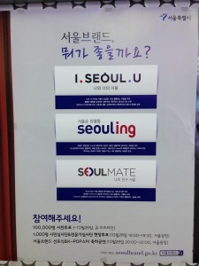 Having opened up an idea contest for a new Seoul brand mark, the city selected three finalists from all the submissions and decided on the winner based on a combination of an online vote open to all (50%), deliberation by 1000+ citizens in person (25%) and the opinion of a professional panel (25%). The slogan “I.SEOUL.U” beat out the other two, “SEOULMATE” and “SEOULing,” and will replace the old campaign “Hi Seoul” which has been in place since 2002.
The online poll highlighted the main features of each of the three slogan-based identities. I didn’t understand the aspect of leisure the city seemed to be pushing with the new Seoul brand, but perhaps it is aspirational and intended to attract tourists. Or it may just not be my personal, lived experience of this brand, an intensely busy city where my younger cousin spends weekends preparing for his college entrance exam at the ubiquitous hagwon and friends routinely stay late at the office finishing up work, even on Fridays.
SEOULMATE
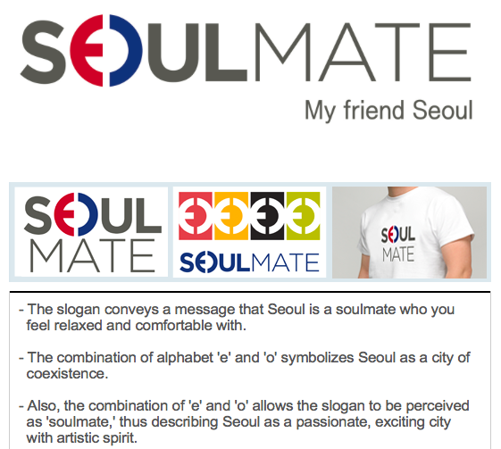
My first instinct was to vote for “SEOULMATE” which required no explanation and is a play on the words “soul” and “Seoul,” a theme that has been used in many a CafePress-designed t-shirt in years past as well as in the old “Hi Seoul” campaign. It won the online poll but lost the vote of the expert panel and the citizens gathered in person. As I considered my own vote, I finally dismissed “SEOULMATE” as a bit stale and also limiting in the way it cast Seoul, potentially furthering the cute agenda already propagated by the aesthetic of adorable Korean stationery supplies, K-pop and such.
SEOULing
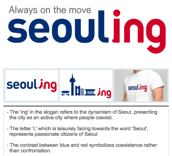
Of the three finalists, “SEOULing” with its progressive tense “ing” captured best the dynamism I sense in this city. My instructor for a Korean political science class used to say that if there’s one word to describe Korean politics, it’s “dynamic.” It’s a good word to describe many other aspects of Seoul and even the rest of Korea, a country that is constantly changing and seems foreign in a new way each time I visit.
As an example, I was surprised at how quickly I was able to complete the steps to apply for my visa at the immigration office, the kind of process that would surely have taken me all afternoon at an office like the dreaded New York DMV. I was also bewildered to learn that Korea had changed the mailing address format this past summer and also changed the law regulating the opening of bank accounts, effectively blocking me from opening one. Seoul is nimble and “always on the move” as the brand tagline says.
I.SEOUL.U
So what does the chosen logo “I.SEOUL.U” convey?
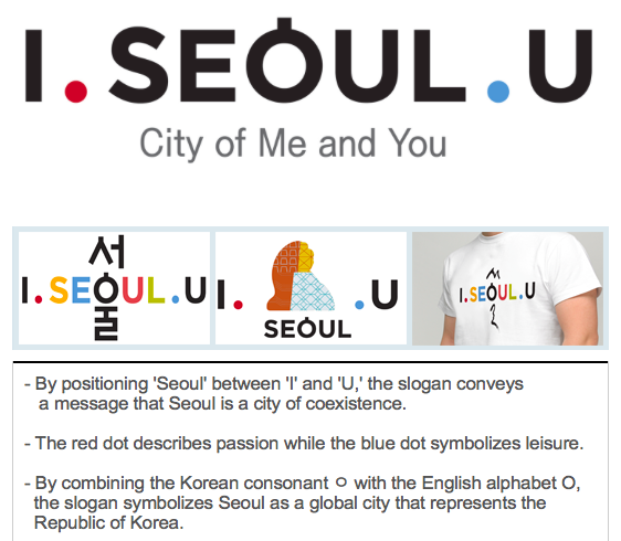
The subway posters advertising the polls for the rebrand cited “I Love NY,” “I amsterdam” and “be Berlin” as examples. But the winning “I.SEOUL.U” lacks what those other city brands possess—stickiness and immediate familiarity which makes you identify with the city. Though I was not aware of the “be Berlin” campaign prior to seeing it on the ad, the slogan clicked with me without effort and I found myself imagining what it would like to be a part of Berlin. Granted, I’ve already been dreaming of Berlin for a while, but the slogan stirred my desire to visit and experience that fabled city and the idea of its brand has stuck in my mind.
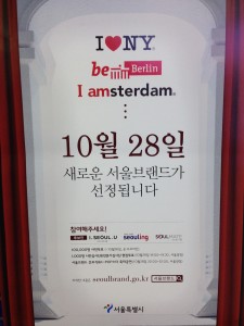
On the other hand, when I saw “I.SEOUL.U” my initial thought was, “What does that mean?” Once I skimmed the explanation my response was “Oh, I guess that makes sense.” As a Korean-American expat newly relocated to Seoul, it didn’t resonate with me the way it must have with many of the voters and all nine of the experts on the panel who chose the slogan. It left me slightly confused, if anything.
With its tagline “City of Me and You” the new Seoul brand does highlight the emerging coexistence in the city with multicultural families in public discourse and non-Korean foreigners conspicuous throughout the city. And it’s great that this one combines the Korean character ㅇ in the Korean spelling of Seoul with the English letter O. It’s admirable from a number of angles, but the logo does not feel intuitive and it requires an explanation. Maybe it’ll grow on me.
City brands as global ambassadors
The official website of Seoul metropolitan government says: “Without city branding, nation branding is an illusion. The way you brand a city can change the status of a city and highlights the differences between your city and others.” The city site conveys clearly that Seoul is South Korea, just as Paris is France and London is England. A city brand represents more than just the city proper and is a global ambassador that can define an entire nation to the rest of the world.
Seoul has already achieved its 2007 goal of becoming ranked as the world’s 10th most powerful city brand according to the 2014 global city brand survey by the Guardian in which it was ranked #5 ahead of major cities like San Francisco, Rome and Tokyo. If this new Seoul brand doesn’t prove effective, I’m confident that dynamic Seoul will devise a new way to propel its morphing brand into the minds of the world.
Do you need an affordable way to improve your brand today?
Because we know that not everyone needs or can afford our full process, we created a guided tutorial package for our foundational brand strategy tool: the Brand Pyramid. Watch the video for a preview.

For more information on the brand strategy tutorial, visit here where you will find a fuller explanation and link to a free download of the first video.
Image credit: Logos from the Seoul brand poll web page; Photos by the author
This raises some interesting questions for me.
I looked at the contest rules since this kind of crowdsourcing can be problematic. If you’re part of the general public, the prize money is a little more than $2,600, but if you’re a student, it’s only about $870. Why does your role in society have any bearing on how much prize money you win?
On another train of thought, considering that Milton Glaser did his NYC logo pro bono in 1977 when the city really needed a boost—and he ended up charging roughly $2,000 for mechanical preparations and nothing more—it seems like we in the design profession could use some more inflation given the intervening 38 years.
The fact is that all design work seems to be under a kind of commodification pressure, and contests like this one make this trend worse. How many total human hours (design-human hours) went into what last Wednesday become this city’s brand identity? (Remember, this is not a city on the down-and-out as New York City was in the 1970s.) If you add up the total prize money and divide it by all the design labor that contributed to Seoul’s new brand identity, what then becomes the value of a designer’s time? Is it $2 an hour? Not likely. A fraction of a dollar an hour is the most likely figure. Who works for such wages? Designers, apparently.
Maybe this is the wrong way to think about this, and indeed everyone who contributed understood that they would likely get nothing for their efforts—operating on a kind of mass pro bono contract. I think it is important to recognize this if you are a government or another type of organization that chooses to mount such a contest.
I do see the advantages for the organizers of such contests. They get to have a below market fixed cost for design. They get a lot of ideas to choose from, and there is even a pretty good chance that something interesting might come in. It’s very expensive to advertise these things of course, the city government apparently spent more than $400,000 in “research and development” which must have included all the advertising and PR, but the competition and its promotion is part of the hype that leads to the final unveiling. It’s all self-reinforcing and this degree of public participation and input helps to inoculate the city from the inevitable criticism that comes with the debut of any logo. It’s actually a pretty good option, except, perhaps, for the design community.
Going back to the quantification of value built into this kind of contest in terms of artist compensation: What if you won? What if I were a student and spent 50 hours doing research, sketching ideas, revising and redoing them and finally breaking through to something really good, and then after getting my best ideas prepared for final submission, including all of its variations, in-context examples and final refinements. This process easily requires north of 50 hours, and possibly much, much more. What if then, against all odds, my logo is the winning idea? I will have earned slightly less than $18 per hour. And to all the non-winning designers who put in equal or greater effort?
Nothing.
You’re right that this is a great way to defend yourself against the inevitable criticism—the city just has to remind citizens that they voted for it or at least had the chance! Reminds me of when Gap unveiled a new logo and took it back after all of the complaints … if they had their customers vote on it, even if it sucked, they couldn’t have been blamed. A Korea Herald editorial described this very reaction: “The Seoul Metropolitan Government is defending its new city brand by saying it was the people’s choice. Pointing out that all new brands face initial skepticism, the city said the public would get used to it.”
From scouring the web, it seems like nobody is satisfied with the new brand. I suppose backlash is inevitable but this logo seems deserving of it. We will have to wait and see but it would be a shame if they spent the approximated $1,322,160 USD in rolling out the new brand only to realize it’s not going to work.
I wonder how much more would it have cost them to hire an agency to come up with the final brand. This Korea Times article says the city spent approximately $437,215 USD in R&D for the logo plus 3/5ths of that on the launching concert/ceremony. Is there an average budget to compare to for this sort of thing, a major city rebrand?
Great post, Joyce. It is important to share these kinds of stories, as otherwise it is difficult to learn about city branding processes and their outcomes.
I think the participatory process organised by the city government was meaningful and reflects a new trend in city branding. One of the pioneering cases in this respect is Glasgow, which with its People Make Glasgow brand, launched in 2013, created not only a great brand but also a great brand story. Just a brief quotation from their official site: “Glasgow’s brand has a unique story. The brand was developed through a global, digital conversation which asked the question ‘What makes Glasgow a great city?’ Over 1,500 people from 42 countries contributed to the conversation by sharing their brand ideas, stories, images, videos, music and poems. Overwhelmingly, the number one response from contributors was that it’s the people of Glasgow that make the city great, which, ultimately, led to the development of PEOPLE MAKE GLASGOW as the city’s new brand.”
Now, while the process in Seoul engaged people in expressing brand stories and the building blocks of brand identity, which is certainly a right thing to do, the next steps, which require ultimately convergent thinking, may not have everything right. That is, distilling the core ideas, creating a brand story, formulating slogan and designing logo did not produce a result that is obvious crystallisation of the city itself, that attracts our attention, generates excitement, or makes us want to know more.
Let me compare my reception of these two above mentioned logos. When I saw Glasgow’s new brand, it felt immediately powerful; it was aspirational yet firmly rooted in the city and its people, and it matched pretty well with my own ideas of the city, as I had anyway some firsthand experiences of it due to my many visits to the city. Unfortunately none of the three new finalists in Seoul’s logo contest gave me the same feeling. If any, I probably would have developed a new logo on the basis of the ‘Seoulmate’ idea (with better visualisation than we saw in the above sketch, however). In all, I feel that even if it may be that Hi Seoul needed to be replaced by a new logo, the city government should have tried to avoid being too hasty, as difficult as it may be under Korea’s pali-pali culture. Namely, the result looks as if there was a contest in which laymen and experts were forced to choose between three unfinished logo options. The result is not unanimously praised by Koreans either, so I have heard. Only time will tell if the chosen logo will have wind beneath its wings.
Having said that, this case like many other before it shows how difficult it is to create a good logo that reflects city’s brand identity, is aspirational and is able to convey a message in such an efficient way. And did I like ‘I amsterdam’ when it was launched? Not really. It rhymed to a degree, but was too ‘plastic’ to my taste. What helped it its case was its great visibility especially in Europe, its wide use in city’s communication, and in general, its professional implementation. Besides, even a poor logo can hardly destroy the image of a good city 🙂
So, it may be that I.SEOUL.U eventually becomes bigger and deeper than what it looks at the time of its launch. Seoul is a great city from where I have great memories. I do hope it will succeed in its branding and that this new logo eventually appears to be useful in city government’s strive for success.
Hi Professor Anttiroiko,
Thanks so much for your insightful comment—it’s great to hear city branding expert! And thank you for the background on Glasgow’s brand.
I’m impressed you have a sense of the Korean pali-pali culture; while it encourages hyper-efficiency, I can see that it could also result in something half-baked due to the haste.
I guess only time will tell if the new brand will work out or not …