Post published in June, 2013
It’s really no surprise that the Internet has gone through another seismic shift. We are watching the dramatic rise of mobile, and the death of Flash (or at least a very serious stroke) brought about in no small measure by some choices made by Apple.
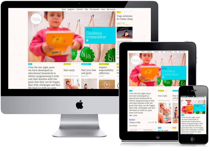
So what is happening as a consequence? One thing is the use of what is called “responsive design.” The Bija Kids website that you see here is an example that we designed recently. In the past, if you wanted your website to function well on a mobile device, such as an iPhone, you had to spend the extra time and money building a mobile version of it.
There are still some advantages to this. Mobile users are not generally visiting a site for an immersive experience or a leisurely browse, more often than not they are after some specific information: “What are the hours of that store? What are the directions to that museum? What is the address of that company?” A custom-built mobile version of a website can do an excellent job of catering to these kinds of mobile-specific needs.
It’s really no surprise that the Internet has gone through another seismic shift.
But mobile is no longer the only way your site is being accessed. There is an increasingly wide range of browsing experiences that a user might employ to visit your website: a cinematic desktop display, a small desktop monitor, a notebook computer, a tablet, or one of many mobile devices. If you wanted to optimize the user experience for all of these, you would need to think about each of them differently and cater to them. This is essentially what responsive design is intended to accomplish.
What is responsive design?
A responsive website detects the size of the user’s open browser window and serves up a version or configuration of the website that is most suited to it. So essentially there are 4 or 5 variations of the website design, and depending on how the site is being viewed, the appropriate version appears on the screen. This is made slightly cooler by the fact that the scripts can actually adjust on the fly so if you manually change the size of your browser window—making it larger or smaller—the website will reconfigure accordingly.
Responsive design has been around in various forms for a few years, but it is now coming into its own, and should be a serious consideration for any new website project or facelift.
Responsive design should be a serious consideration for any new website or facelift.
It is more complicated and costly than designing and producing a static site optimized for a given screen resolution, but most of the extra work is actually in the design and planning, not the programming. And it is generally less costly than separate desktop and mobile sites.
Another factor when considering a responsive design is the design itself. Crafting a website design that responsively adjusts to different size interfaces places a variety of formal restrictions on the design. All the content elements are going to have to be able to shift around to accommodate each interface and still look good while doing so. This results in a lot more variables to consider, many of which have an impact on both the design and, to a lesser degree, the content and how it can be displayed.
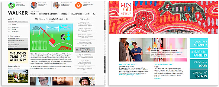
Say for example, you have a complex editorial style page like the Walker. Here you have to sort out how all of these elements are going to rearrange and not just get smaller as you have progressively less and less space to work with. On the upside there are already a lot of relatively modular elements. On the downside there are a lot of them to sort through.
Compare this to Mingei International Museum where the elements are already reduced and very hierarchical. Here it’s more of a matter of just figuring out the specifics of exactly how it’s going to happen.
There are already some major museums who have made the transition to responsive. One great example is the Cleveland Museum of Art (no stranger to successful innovation). This is a case where an entirely new visual structure has been built to accommodate the need for responsive flexibility.

Responsive design, while perhaps not for everyone, can significantly enhance the user experience across platforms and we do recommend it for most new web development projects as well as facelifts. How well suited it is for your project is a matter of thinking through what will actually be required.
Feel free to let us know about your thoughts and experiences with responsive websites.
Ask for help.
We are kind, thorough and ready when you are. You just need to ask.