Strategy before design
The exhibition headline for this museum exhibition advertising campaign came to President and Lead Strategist of Tronvig James Heaton in a dream. But the strategic work that initiated the headline and allowed it to survive to anchor an advertising campaign is a good illustration of Tronvig’s exhibition marketing strategy and philosophy in action. Core to Tronvig’s philosophy—whether we are refreshing a visual identity, launching a brand awareness campaign, or promoting an art exhibition—is our insistence that strategy must come before design and that good strategy must place a premium on including the voice of the customer.
The perspective of the target audience (the customer) must be understood and then put front and center. So it’s not about what the museum has to say but how best to communicate the value it brings to the audience it seeks to attract. Knowledge of the customer gives designers the confidence to explore directions they might otherwise have been unable to pursue, and it gives the resulting designs a supporting rationale that insulates them in the face of critiques such as “I don’t like it.”
The result, in this case, was well above the baseline average daily attendance for special exhibitions at the National Museum of Women in the Arts (NMWA) and a Platinum Award from the Muse Creative Awards in the outdoor advertising category.
Champion women through the arts
We’ve been working with NMWA for several years now on an extensive rebranding process that has transformed the institution from the inside out. Having accomplished its original mission of putting women artists on the walls of a major art museum, NMWA sought to evolve and deepen its impact. We’ve helped reposition the museum as an energetic advocate for gender equity in the arts. Its updated brand idea, “champion women through the arts,” is supported by a slate of programming focused on creating spaces for dialogue on gender and social change and supporting women artists.
The museum’s exhibitions have been much more consistently in line with the new brand idea. Recent offerings have included She Who Tells A Story, featuring contemporary women photographers from Iran and the Arab world; Women House, a sequel to the landmark 1972 feminist exhibition curated by Judy Chicago and Miriam Shapiro; and this exhibition, Magnetic Fields: Expanding American Abstraction, 1960s to Today. (More on this last title next.)
Black Abstract
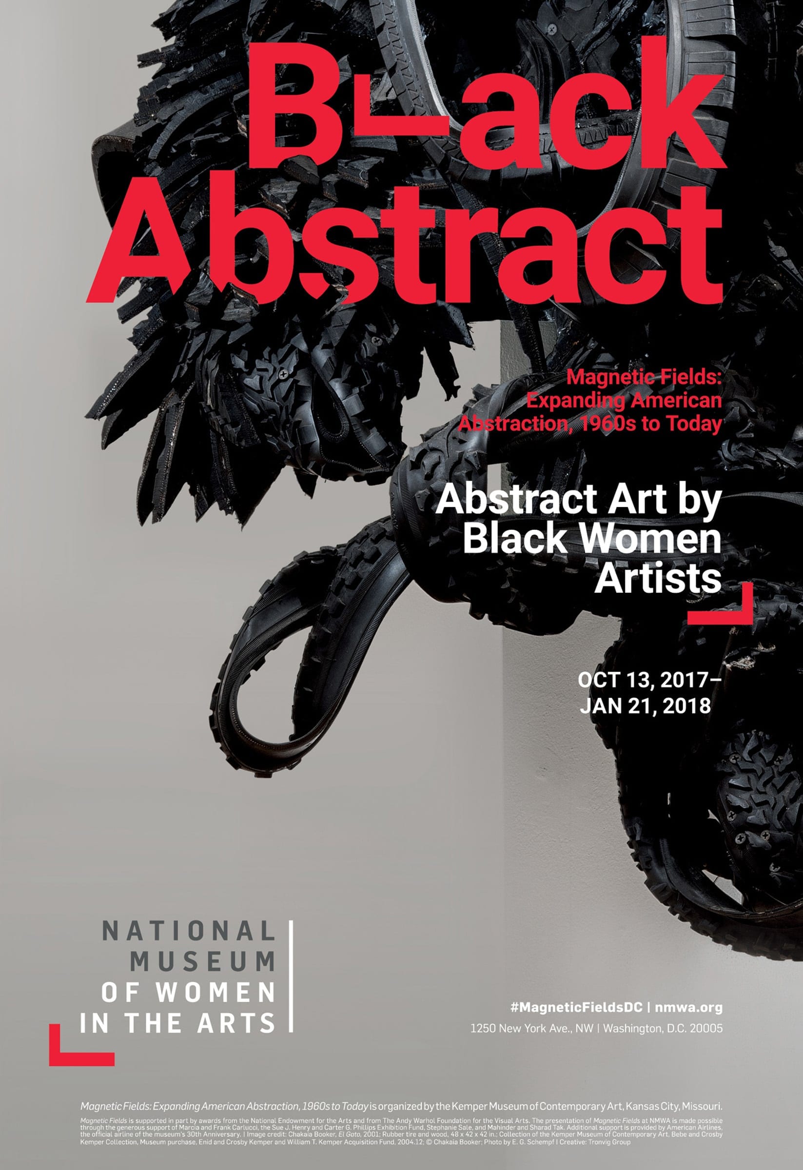
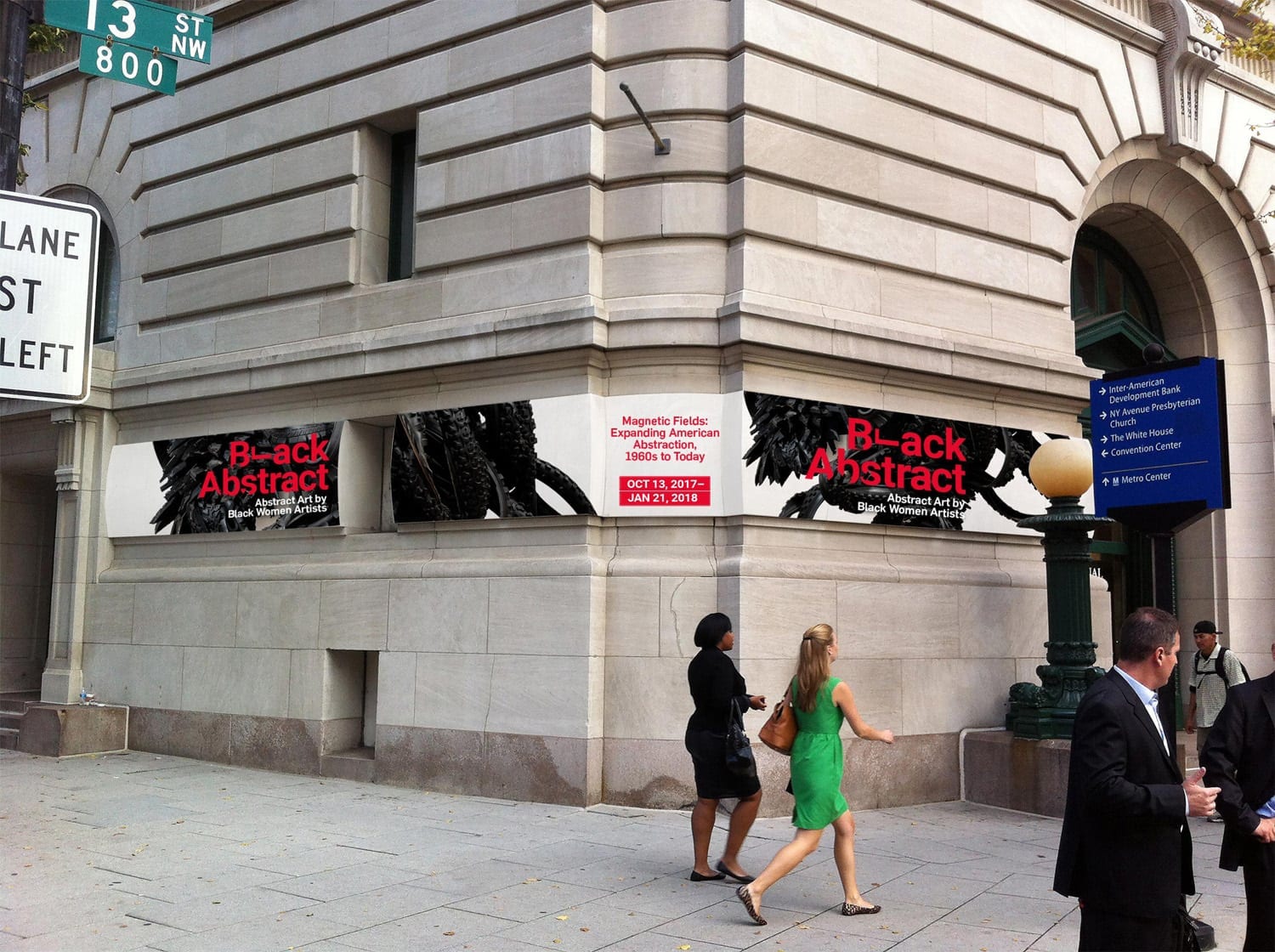
Black Abstract was our campaign headline to solve difficulties with the exhibition title, Magnetic Fields: Expanding American Abstraction, 1960s to Today. In addition to being confusing and unwieldy, the original title ignored the exhibition’s most distinctive feature: it was the first-ever exhibition to exclusively feature abstract art by black women artists. The twenty-one women in the exhibition were mostly under-recognized leaders in the development of abstract art, so the show aligns perfectly with the new institutional brand idea.
It was also, as we decided in our initial strategy workshop for the exhibition, an important opportunity to attract a new audience to the museum: African American art buffs. The racial disparities in museum visitorship are well documented. African Americans account for 11% of the U.S. population but only 6% of museum visitors. The average museum visitor is white, female, and middle-aged or older. NMWA’s core demographic since its founding fits squarely in this mold.
Our exhibition marketing strategy had to overcome a variety of obstacles, including minimal awareness of NMWA with our target audience and the inherently niche attraction of abstract art. As with all marketing strategy projects, we conducted in-depth interviews with the target audience to bring their perspective to the forefront. The consensus was clear: the full “Magnetic Fields” title was confusing, and we would achieve much greater appeal with our advertising if we emphasized black women artists as the exhibition’s exclusive focus.
Speaking to your target audience
We took great care to get as many perspectives as we could on what language was best. Existing descriptions used the terms “African American” and “women of color.” Our interviewees agreed that these were politically correct but ultimately inauthentic terms. For one, “women of color” inaccurately implied a wide variety of ethnic origins. In reality, the show included twenty African American women and one Caribbean American woman.
Further, there was a clear sense that using the term “African American” would be interpreted as “people talking about black artists” rather than black artists speaking for and amongst themselves, which was the exhibition’s goal: to highlight previously underappreciated artists and put them in dialogue with one another.
There was a clear sense that using the term “African American” would be interpreted as “people talking about black artists” rather than black artists speaking for and amongst themselves.
Everyone we spoke to agreed that the language question was difficult and that the impulse to tread carefully is understandable. As one interviewee put it, African American is a term for “white people who don’t have many black friends.” The unfortunate reality is that for most museums, this is the case: we mentioned the disparity in visitorship above, and amongst museum staff, it is even more stark, particularly in positions of intellectual leadership.
The good news is that there are an increasing number of much-needed efforts to address this situation. But in the context of our promotional campaign for this exhibition, what’s the best response? The results of our research process pointed to prioritizing authenticity, and “black women artists” was the most accurate and most authentic language we could use. Rather than being offended, interviewees said that it would be refreshing for the museum to choose not to walk on eggshells.
Execution and results of strategy
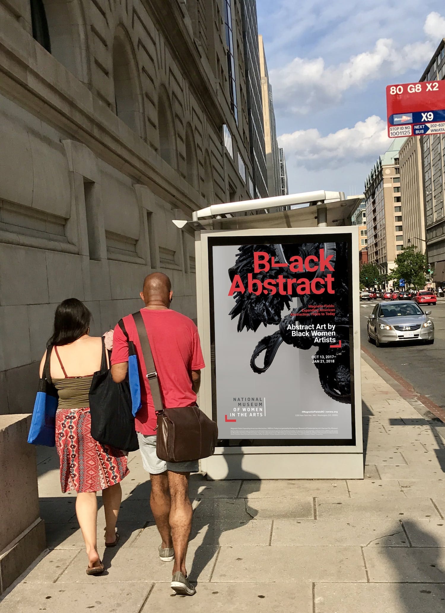 With the voice of the target customer in mind, we proceeded with a bold verbal and visual strategy for the marketing, highlighting a detail of a visually striking Chakaia Booker work from the exhibition. The headline “Black Abstract” was the simplest distillation of both this particular work and the works collected in the exhibition. It also effectively caught the attention of our target audience. We de-emphasized the original title, which we knew would be invisible to the target, in favor of a more evocative subheading that clarified the exhibition’s central offer: “Abstract Art by Black Women Artists.”
Without the insight from our research process, it’s unlikely that the curators would have been comfortable with this rearrangement of messaging priorities. But it’s fortunate that they were: the exhibition was a substantial success.
We have developed a nuanced return on investment metric for NMWA’s exhibitions that accounts for a variety of factors, including average daily attendance, new membership sales, museum shop sales, and Net Promoter Score. We also factor in the exhibition development and marketing costs to arrive at a total cost per body in the building.
Without the insight from our research process, it’s unlikely that the curators would have been comfortable with this concept.
Black Abstract had the second highest ROI of any exhibition in the past four years. It also yielded the most new memberships of the six most recent exhibitions, suggesting that we successfully appealed to a new audience as we were hoping to. Artnet’s headline for a glowing review was “Yes, Black Women Made Abstract Art Too, as a Resounding New Show Makes Clear.”
The strategic groundwork made it possible for us to design a campaign that spoke to the target customer and the survey findings provided the confidence to proceed in an assertive creative direction. It’s strategy that allowed us to advertise the extraordinary works of underrepresented women artists in a way that resonated with the intended audience, helping the National Museum of Women in the Arts carry forward its important mission.
Tronvig Creative Credits:
Art Directors: Sarah Ahrens & Florencia Garcia
Creative Director: James Heaton
Ask for help.
We are kind, thorough and ready when you are. You just need to ask.