Comments on the new Met logo at bottom.
“Met”
![]() The Metropolitan Museum of Art in New York City, commonly referred to as “the Met,” recently hired a brand consultant. Apparently he/she recommended that they call themselves “Met” without the article—no “the”—and there is a new logo in the works.
The Metropolitan Museum of Art in New York City, commonly referred to as “the Met,” recently hired a brand consultant. Apparently he/she recommended that they call themselves “Met” without the article—no “the”—and there is a new logo in the works.
Interesting. Word is that a board member struck down the suggestion to drop the article in the name.
Here is my question in this particular bout of brand consulting: What customer integral to the continued and future success of this great institution is “Met” intended to appeal to? How does our brand consulting friend know that this act will contribute to the institution’s ability to get to its future happy place?
Without a good answer to this question, what are they doing?
Change for change’s sake is a dangerous business.
Change for change’s sake is a dangerous business. I realize that changing the name and the logo of the Metropolitan Museum of Art will not mean that millions of loyal customers will suddenly be unable to find the museum as they walk up Fifth Avenue. I’m alluding to what happened a few years ago when Tropicana executives wanted to change the orange juice packaging because they were tired of it. When they did this, people were unable to find the product on the shelf, sales dropped and the redesign was unceremoniously retracted after costing millions. This is not going to happen to the Met, but I would suggest that the reason for wanting to change the logo may be very similar. The Tropicana do-over was driven not by consumer need or market demand or even updated strategic vision. It was instead driven by the executives simply having grown tired of what they had. Could this be what the Met is doing? Is it some version of, Change is good! Look at the Whitney!
Brand consulting
Ahem, attention brand consultants—and to those who listen to brand consultants: Change is only good in service of strategy. Strategy should involve innovation and risk-taking, but only in the context of a thorough understanding of who you are innovating for and why you are taking those risks.
Strategy should involve innovation and risk-taking, but only in the context of a thorough understanding of who you are innovating for and why you are taking those risks.
Admittedly, a logo change for the Met is a low-stakes gambit. It’s not low stakes for every institution, but for them, there is no real danger of suffering greatly from any mistakes with their visual brand. They are fortunate. They enjoy the benefit of being a one-of-a-kind top-tier destination attraction, a world stage cultural institution with an extraordinary and encyclopedic collection that is situated in one of the world’s most prosperous, cultured and well-visited cities. So okay, if the director wants a new logo because he’s the new director, fine, no real harm will come of it.
For most other institutions though, it’s potentially a bad example to follow.
Here’s why:
Brand differentiation
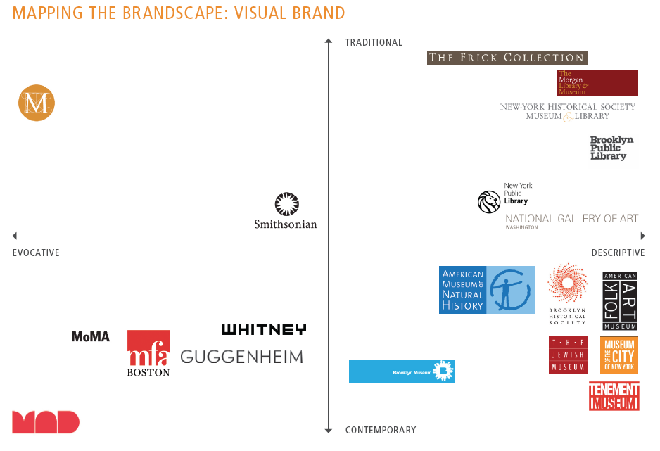
In 2011 we created a graph of a selection of leading cultural institutional logos in and near New York City for one of our clients. What’s really interesting about this chart looking at it now is the fact that there is only one institution that holds a truly enviable position from a visual brand strategy perspective. You guessed it: the Met. A key objective for a visual brand is differentiation, and New York City, with more than 100 institutions that call themselves museums, is a genuinely competitive market. What is better than having a visual brand in such a context that effectively puts you in a class by yourself. That’s where the Met is.
The current identity has the added benefit of playing to their natural strength; it’s a reference to Da Vinci’s vitruvian man, and so places them squarely in the context of their incredibly rich collection of masterworks from all ages, the greatest accomplishments of human endeavor. In this, they are unchallenged in New York City and even the United States. Yes, the Met also has a collection of modern and contemporary works (and lots of other things), but the modern and contemporary work is in a hotly contented brand space and the other things are not the main story the Met’s brand should choose to tell because any consumer with a passion for some niche “product” will find that product wherever it is. They will come anyway.
Simplicity
Brands suffer from trying to tell too many stories. It’s natural to want to tell many stories about all the wonderful things that you do. But brand power resides in simplicity. So it comes down to which story you are going to tell. For the Met the story they tell with their current logo is ideal in the sense that it leaves them essentially unchallenged.
So I’d be willing to bet that anything they come up with will likely move them closer and not further away from the densely packed competition that inhabits this city and its surrounds, and thus it will likely yield slightly greater confusion in the minds of those brand consumers who don’t already know them intimately.
I am very curious to see if they can do better.
Strategy
Maybe the version of this grid that they are working from is entirely different. Maybe they have a clear strategic notion of an audience they must attract that will be positively influenced by a shift in one direction or another. I trust that they have a well-articulated, thoughtful and inspirational strategic plan that lays out for them what needs to be done and that clarifies how a new logo can be enlisted to help with that strategic scheme … or maybe they simply feel they have had this logo for too long and it is time for a change.
It’s not low stakes for everyone, but for the Met there is no real danger of suffering greatly from any mistakes with their visual brand.
If you are in a situation where you hear someone on your board or a new executive say: “We’ve had this visual identity for 20 years. It’s time for a new one, let’s go get a brand consultant to help us,” that’s great, but make sure the consultant you hire insists on asking this question: Why do you want this? Is it driven by strategy or by your own fatigue with something you have grown tired of looking at? Strategy should be informed by more than just internal desire.
Why?
I am intently curious to see what the new logo for the Met is going to be. I am a long time and loyal fan of the institution. The Met was, in fact, a key reason I chose New York City as home 25 years ago. I want the Met to continue its splendid success, and I’m not really worried, but I do think that this action can serve as a teaching moment for every institution. There will inevitably come a time when someone asserts, “We need to change this!” At that moment it is crucially important to get clarity on why.
The question “Why?” must be asked again and again until you have a really great, root cause exposing answer.
Does your museum need an affordable way to improve its brand today?
Because we know that not everyone needs or can afford our full process, we created a guided tutorial package for our foundational brand strategy tool: the Brand Pyramid. Watch the video for a preview.

For more information on this brand strategy tutorial, visit here where you will find a fuller explanation and link to a free download of the first video.
Curious as hell to know what you think now that it’s shown:
http://www.vulture.com/2016/02/metropolitan-museums-new-logo-the-met.html
Lindsay,
From my vantage point on the outside I cannot see the strategic imperative for which this is any kind of a tactical fulfillment. I cannot discern the principles that might support it. That does not mean they are not there, I just cannot see them.
One explanation might be that someone wanted a new logo and he got one. That would be brand fatigue.
The good news is that a brand is not a logo and this brand is very strong. It will not suffer much from any logo no matter how ahead or behind its time. The Met can do almost anything with its visual brand and the brand as a whole will be just fine. So this is a low stakes game.
On a more practical level, this logo is so idiosyncratic that I can only imagine that the next director might want to change it again. That’s some expensive fun.
On a final side note, it’s interesting that they seem to have been able to stay in the same quadrant of the graph. (We might have to redo the whole graph since many of the institutions highlighted have updated their logos since we did this.)
The strategic explanation for the logo seems to be summarized in an effort to “help us expand our reach and relevance.” The whole integrated brand communications system will be rolled out in March and this will help us understand if this logo constructively contributes to that.
Bottom line, it’s very easy to attack a logo. As I read the mostly negative reactions raging over this one I am reminded with a smile of Michael Bierut’s wonderful article Graphic Design Criticism as a Spectator Sport.
More has come out about the thinking behind the new logo and this quote from the Met’s Susan Sellers in Wired jumps out: “There was no single way The Met represented itself. There were just a lot of legacy systems that were overlapping and oftentimes contradictory.” This is a near admission that they were just muddling along. The absence of a single, rigorously applied brand system is the norm even for the Met.
This should be greatly encouraging to all those other institutions who still struggle with their visual brand.