We recently had a small web project for a client that sells a very expensive service. Over many years they had built up a successful business, and they had done this without ever having had a website. They came to us somewhat reluctantly pushed into the wading pool, as it were, by their sales manager, who felt insufficiently supported by the brand. He needed online credentialing and support for his sale activities.
In our conversations with them, it also became clear that their lack of a branded voice on the web was being actively exploited by some of their competitors. One company, in fact, even had a page specifically optimized to capture web traffic looking for our client. Others were also engaged in similar, less sophisticated end runs around them, causing confusion among some of their business prospects.
Their lack of a branded voice on the web was being actively exploited by some of their competitors.
Their business is exclusive and entirely referral-based. They have the best-in-class name recognition in the industry, and while they understood the need to build the website to reinforce their brand position and show legitimacy, some in the company were concerned that this online exposure would attract unwanted attention from lower-end service seekers and result in wasted time and expense for them. We assured them that the design we developed would avoid this outcome by making it crystal clear what kind of service they provided, and it would be obvious to any visitor that this company was not selling on price.
Our original designs did this job perfectly and were exactly in accordance with the brand strategy we had laid out for them. These designs presented the company as a very high-end, high-touch, service-oriented boutique, just as they understood themselves to be. They were very happy with the designs. We were happy that they were happy. All was good.
Then the tweaking began.
“We have to move the text over here,” they said. We countered, “If you do that, the user will have to track across the entire screen in order to read more. This will be annoying and cause problems on smaller displays.” “No, we have to do it.” These adjustments came in one after the other. “Can we center the logo?” “Can we get rid of the extension of the image over here on the left?” “Can we put more color back into the photography?” and so on, until by the end, we had a final design that was quite different from where we began.
With each change they made, the website became more standard, more typical, more like other sites.
This process is to be expected sometimes with clients who are assertive and stubborn, but what was unfortunate in this case, and why I’m writing about it at all, was that with each change they made, the website became more standard, more typical, more like other sites. The final built website is still not likely to attract any bargain hunters, but without exception, every change lowered the asking price.
Common and familiar designs indicate accessibility and an appeal to common taste. This business needs to speak to those with uncommon taste so these compromises were all in the wrong direction. A standardized design implies a uniformity of service and perhaps, ease of use, but not high-end, high-touch service, which is what they offer. So it turns out that their taste in web design was more middling than their brand position, and instead of trusting us on this, they chose to overrule our advice.
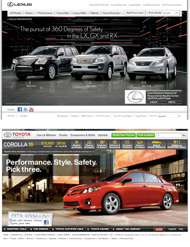
To illustrate this point without bringing up this client as an example, here are a pair of websites for brands everyone is familiar with: Lexus and Toyota. The high-end Lexus brand is almost all grays and blacks and uses a much more muted color palette and a simpler design. By comparison, the more mass-targeted Toyota Corolla page uses a wider variety of colors (gray, red, green, yellow) and a slightly messier, more cluttered design. Less is more—more expensive that is. The same principle applies nearly universally.
So back with our client—the place we ended up was ok in terms of design, and the client was very happy. The website will do the work it needs to do for them: It will support the sales process. It will legitimize their business in the eyes of prospects who are contemplating the choice of using them or going with a lower-priced supplier. It will give them a respectable web identity that will curtail the ability of unscrupulous competitors to usurp their online traffic, and it will support and validate their existing business relationships.
It will not, however, do what it might have done—elevate their brand to exactly match their self-perception as an ultra high-end purveyor of their service. This is too bad.
Ask for help.
We are kind, thorough and ready when you are. You just need to ask.